A Gen-AI grid-intelligence pilot by Luis Ramos. Access is limited to keep the live-AI costs in check β€” please enter the access code to continue.

πŸ”‘ The access code is in my cover letter.

PNM Grid Intelligence

What's happening right now: live weather-driven outage risk across the U.S. Long-term outage trends are in the Analytics tab; the interactive map is in Live Map.

⚠ Live weather-driven outage risk

loading live NWS alerts…

🧠 AI situation brief

The hub. Hover or click any state (or county) to drill in. Turn on radar, fire, drought, infrastructure and more with the βš™ Layers button on the map.

Outages by state Β· 2000–2023

Long-term trends and every individual event across the filtered set β€” when and why major outages happen, where the customers are, how long outages run, and the full event list below. The event list blends Major events ’00–’16 (Mukherjee dataset) and OE-417 ’17–’23 (DOE disturbance reports); the Cause / State / year filters and the +OE-417 toggle apply to both the charts and the list.

Outages by year

Outages by cause

Customers affected by NERC region

Outage duration (hours, log scale)

Event detail β€” individual outages, newest first

…

What you'd have seen β€” NEXRAD radar

Was this available in real time? Mostly β€” EIA-930 publishes hourly demand/forecast/net-gen on a ~1–2 h lag (a public mirror of the operator's own real-time systems), and the demand forecast is day-ahead. So the widening gap and the temperature plunge were visible hours ahead of the shed. The exact values here are EIA's revised historical numbers; the as-published real-time figures were preliminary and noisier.

Generation by fuel

net generation by fuel Β· EIA-930

After-action analysis

Click Generate for an AI after-action review tying the public-data signals to what an early-warning system would flag.

What public data feeds the lead-up?

How granular this gets, honestly: weather replays at 5-min / national-composite resolution; outage magnitude is state-level, daily (DOE OE-417). We can't go to feeder/customer level for a historical event β€” that data isn't public at that resolution. Every precursor signal below is wired from a real, public feed:

Precursor signalPublic sourceIn this demo?
Storm arrival / intensityIEM NEXRAD archive (radar)live here
Outage escalation by dayDOE OE-417 disturbance reportslive here
Demand ramp vs. supply (the smoking gun)EIA-930 hourly demand (ERCOT, historical)live here
Winter-storm watches/warnings (days prior)NWS via IEM VTEC archive (WFO FWD)live here
Temperature plunge / freeze lineOpen-Meteo historical archive (Dallas)live here
Generation outages / fuel curtailmentEIA-930 net generation by fuel + OE-417 fuel-emergency flagslive here

The payoff: fused together, these public signals β€” the watch, the temperature plunge, and the demand-vs-generation gap β€” flagged the shortfall with hours-to-days of lead time. That fusion is exactly what a GenAI early-warning system does.

Live PNM grid conditions β€” demand, the peak-load monitor, generation fuel mix, and the wholesale price (EIA-930 & CAISO).

⚑ PNM grid status

Peak load monitor

Demand & net generation by fuel (MW) Β· EIA-930

Wholesale price ($/MWh) Β·

Vegetation encroachment scanner β€” where dense vegetation sits on PNM's New Mexico transmission grid (wildfire-fuel / encroachment risk), opening on PNM's central-NM core. A satellite screening layer: it scans NASA NDVI against the full HIFLD line set (46–345 kV) and ranks every corridor to address first by vegetation density, encroachment extent, and line criticality (PNM-area weighted). Click a ranked site to zoom into sub-meter satellite imagery and inspect the individual trees on the line. Per-tree measurement (height, lean, distance-to-conductor) is the LiDAR step this triages.

🌲 Vegetation encroachment scanner · New Mexico

loading… NDVI
● encroachment hotspot, colored & numbered by priority (deep red / low number = address first) Β· β–¬ transmission lines Β· NM & neighbor state outlines Β· background: NASA GIBS MODIS NDVI 250 m (β–  dense β†’ β–  bare). Priority = vegetation density + encroachment extent + line criticality (46–345 kV, banded), PNM-area weighted. πŸ›° Satellite = real high-res aerial imagery (Esri) β€” a bird's-eye view of the actual terrain under each hotspot; the NDVI tint (recent 8-day MODIS) rides on top.
βš™ Data layers & sources

Map overlays

County hotspots EAGLE-I
County-level customer-hours without power.
↳ County data year
Year shown for county hotspots.
Live radar overlay
NEXRAD doppler radar (IEM) on the map, up to 24h.
πŸ”₯ Active fire NASA FIRMS
Live VIIRS/MODIS hotspots (last 24 h).
🚩 Fire-weather forecast NWS
Red-flag warnings + elevated fire-risk points (next 72 h).
❄️ Winter/freeze alerts NWS live
Active winter-storm, freeze, hard-freeze, wind-chill & ice warnings.
πŸ”΄ Live PNM outages snapshot
Current PNM outage map (Kubra) β€” one snapshot, may be stale.

Datasets

Color states by OE-417 events 2017–2023
DOE disturbance-event counts by state (extends coverage past 2016).
↳ OE-417 year
Year for OE-417 coloring.
Color states by reliability EIA-861 2023
SAIDI (avg outage minutes/customer/yr) by state β€” redder = worse.
Color counties by storms NOAA 2023
Storm-event count per county (switches map to county view).
Color counties by drought USDM
U.S. Drought Monitor severity by county (current week).
Color counties by vulnerability CDC SVI
Social Vulnerability Index β€” who's most at risk when power's lost.
πŸ”₯ Wildfire-outage risk index composite
Fuses drought, fire-weather, active fire, outage history & vulnerability β†’ a 0–100 county score.

Infrastructure (HIFLD Β· Southwest)

Transmission lines
High-voltage lines, colored by kV.
Substations
Electric substations (hover for kV).
Power plants
Sized by capacity, colored by fuel.

Tools

πŸ“„ Reliability report AI-generated
Auto-draft a SAIDI/SAIFI reliability report for a state via the AI agent.
live doppler radar
loading…
πŸ“„ Reliability report generator
🧠 Situation brief
Detail
How to use this dashboard
β–Έ six tabs β€” your main navigation
β–Έ live weather-driven outage risk, right now

1 Β· The big picture

This dashboard maps U.S. power outages and live grid conditions on real public data (2000–today). Six tabs across the top are the navigation: Overview (live weather-risk + an AI brief), Live Map (the interactive map hub), Analytics (the outage filters, trend charts, and the full event table), Scenarios (replay real grid events), Grid Status (live PNM demand & peak monitor), and Vegetation (the wildfire-fuel encroachment scanner). The cause/state/year filters live on the Analytics tab.

β–Έ AI reads the live data & writes the brief

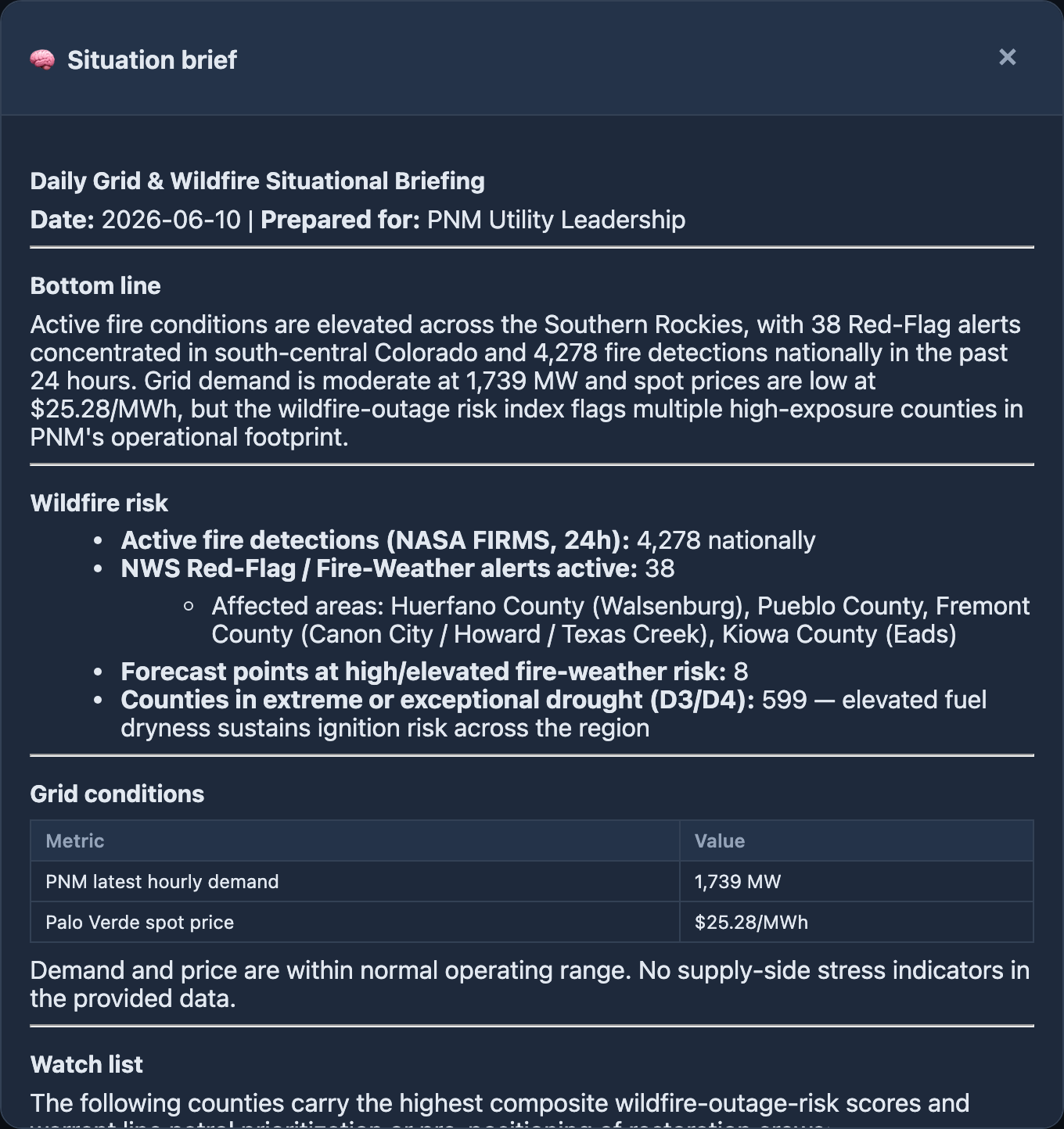
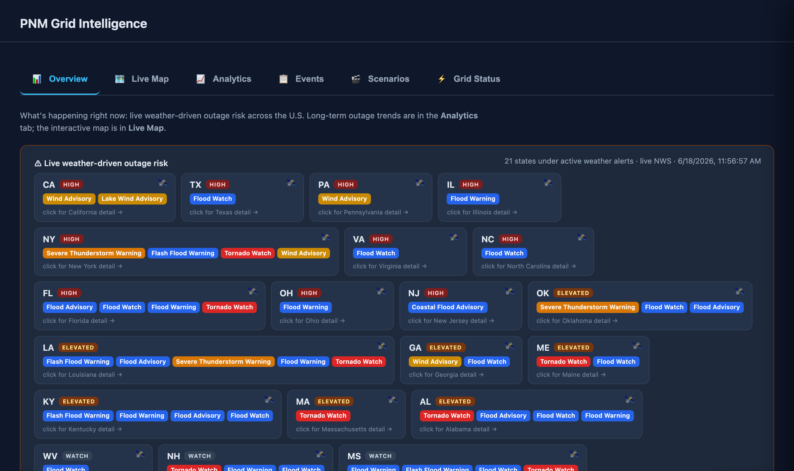
2 · 🧠 Situation brief

The Overview tab opens with an AI situation brief β€” it compiles the current numbers (active fires, red-flag alerts, drought, grid demand and price, top-risk counties) into a one-page, plain-language leadership briefing, led by a PNM watch β€” New Mexico section that zeroes in on PNM's own territory and the risks worth acting on. It's cached and regenerated at most once every 12 h, and every brief is saved β€” hit πŸ•˜ History to re-read past briefs. The fastest read on "what's the grid picture right now."

β–Έ ask anything
β–Έ grounded answer, real numbers from the live data

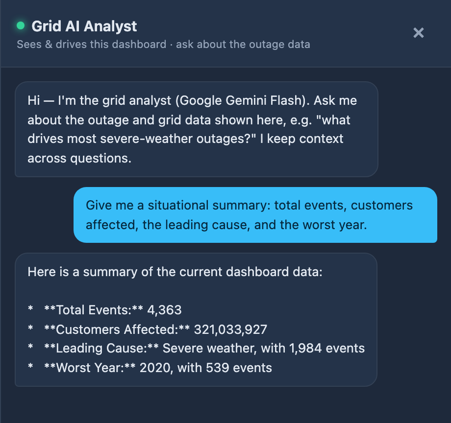
3 · ✦ AI grid analyst

The ✦ AI analyst (bottom-right) isn't a generic chatbot β€” it's wired into the dashboard's live, filtered data (Google Gemini Flash). It answers from the real numbers on screen and respects your active filters: narrow to New Mexico, severe weather, or a year range, then ask, and it scopes the answer to exactly that subset. It holds context across a conversation, so you can drill in.

Put it to work β€” analyze, rank, compare, explain:

β€Ί "How many major outages are in this filtered set, and how many customers affected?"
β€Ί "Which states have the worst equipment-failure outages β€” and what's the pattern?"
β€Ί "What's the trend in weather-driven outages from 2000 to 2016?"
β€Ί "Summarize New Mexico's outage history for a leadership briefing."
β€Ί "Compare winter-storm vs. wildfire outage impact across the Southwest."
β€Ί "Given current conditions, what should PNM be watching for today?"

The same engine threads through the whole app: it writes the daily situation brief (Overview), the after-action reviews on the scenario replays, and auto-drafts SAIDI/SAIFI reliability reports (βš™ Layers β†’ Reliability report). It's grounded and honest β€” it answers from the data, won't invent a number, and flags real data gaps. (Requires the AI backend running with a Gemini key.)
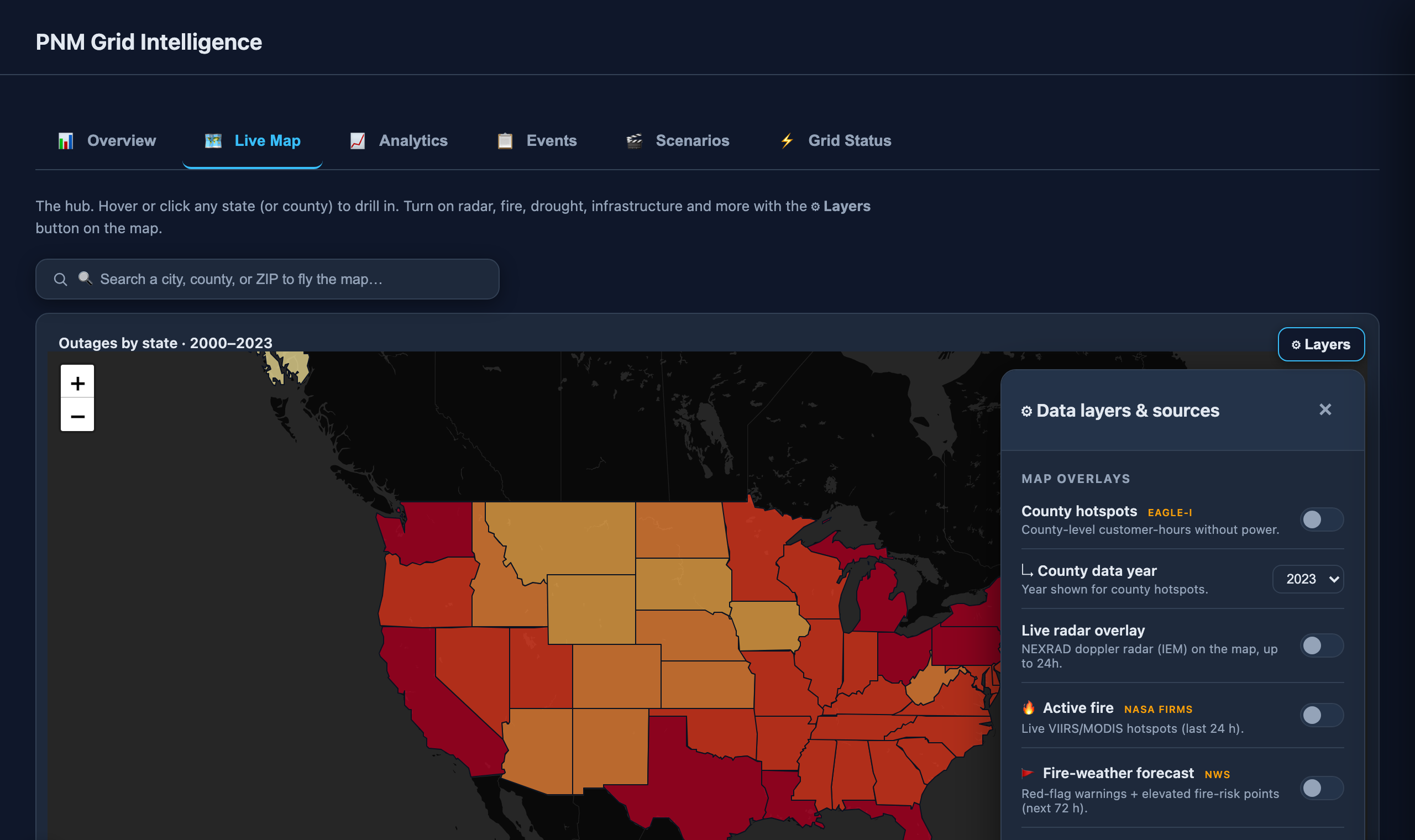
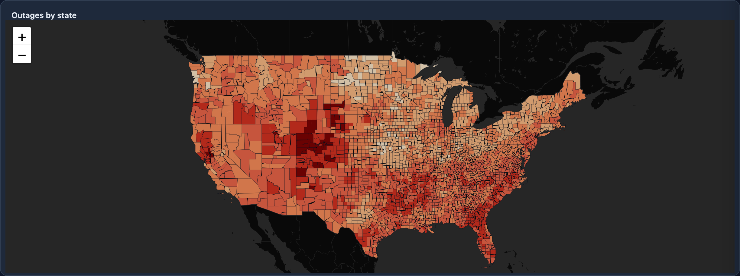
β–Έ search a place to fly the map
β–Έ the βš™ Layers button, on the map
β–Έ flip any layer on/off

4 Β· Map layers (the βš™ Layers button)

On the Live Map tab, the βš™ Layers button sits on the map (top-right). Click it for an on-map control panel: state/county color-by metrics, live radar, active fire, fire-weather, winter alerts, drought, social vulnerability, and grid infrastructure β€” they all draw on the map. The search box above the map flies you to any city, county, or ZIP β€” pick a county and it switches into county view automatically. Press Esc to close it.
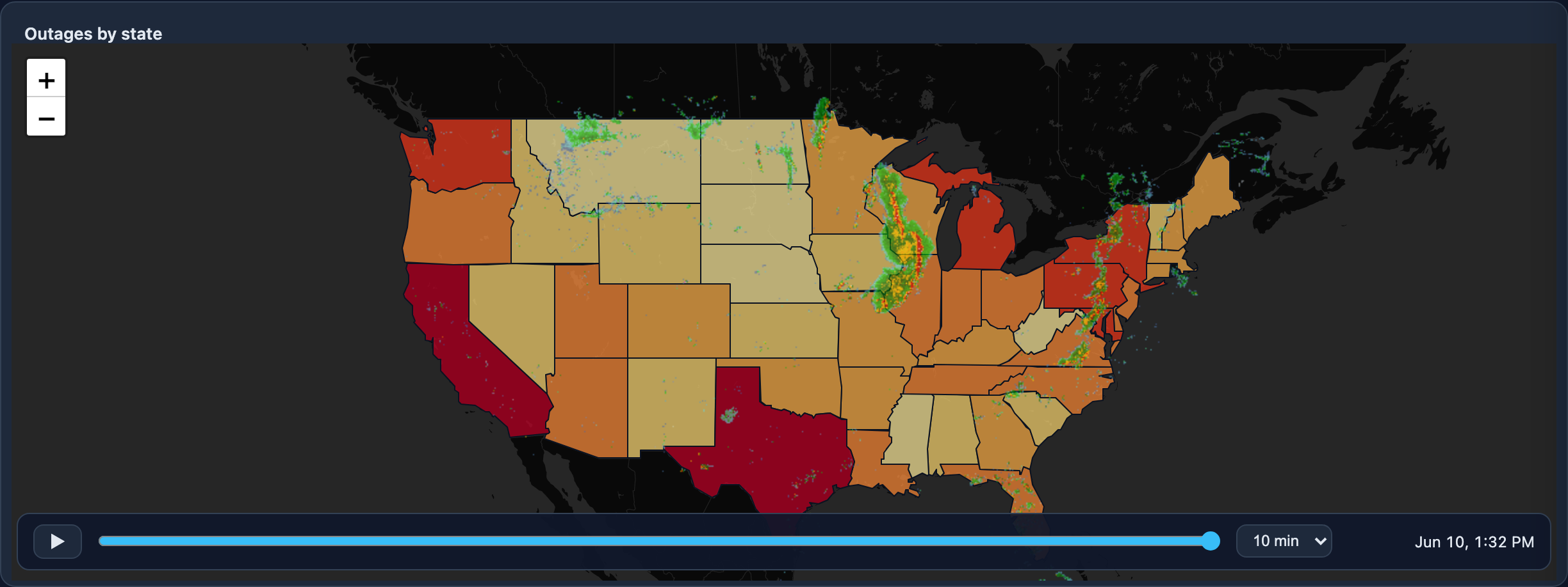
β–Έ β–Ά play / scrub the timeline
β–Έ 10 min β†’ 4 hr step (up to 24 h)

5 Β· Live weather radar

Turn on Live radar overlay and a control bar appears on the map. Hit β–Ά to animate real NEXRAD radar, or drag the timeline to any moment. The step selector covers 10 min up to a full 24-hour day. Radar draws on top of the outage colors.
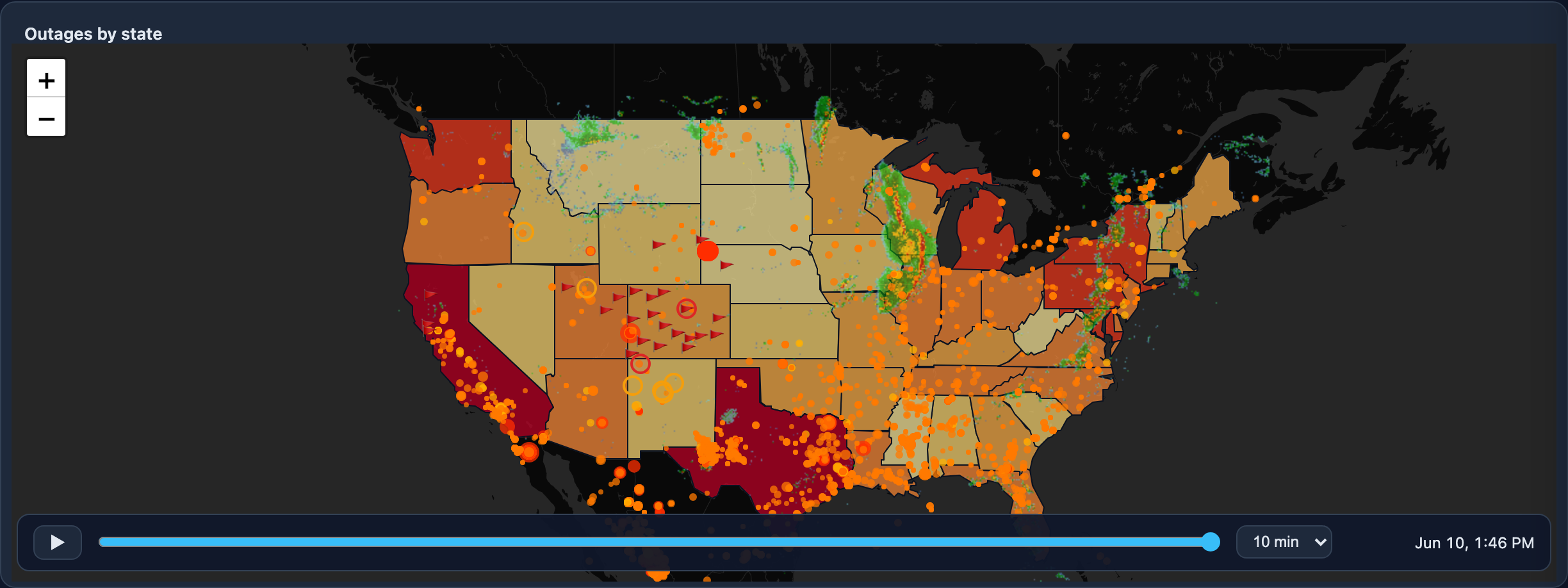
β–Έ live radar (animate)
β–Έ active fire + red-flag warnings

6 Β· Live weather & fire

Toggle Active fire (NASA FIRMS hotspots), Fire-weather forecast (NWS red-flag warnings + elevated-risk points), and radar together to see what's threatening the grid right now. Hover any fire for its heat output and confidence.

β–Έ transmission Β· substations Β· plants

7 Β· Grid infrastructure

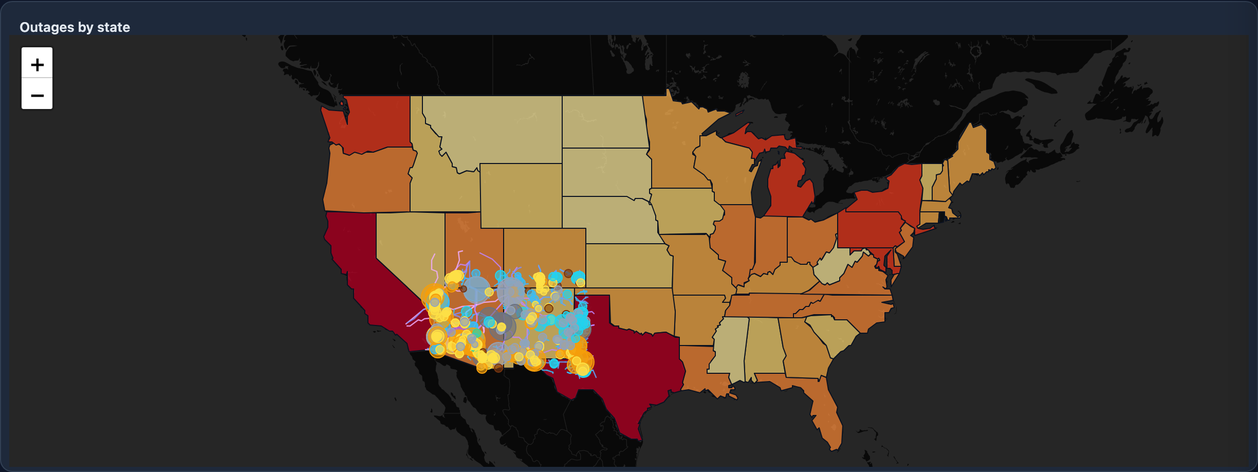
Under Infrastructure, overlay real federal (HIFLD) data: transmission lines colored by voltage, substations, and power plants sized by capacity and colored by fuel β€” so you see where the grid actually runs relative to the hazards.
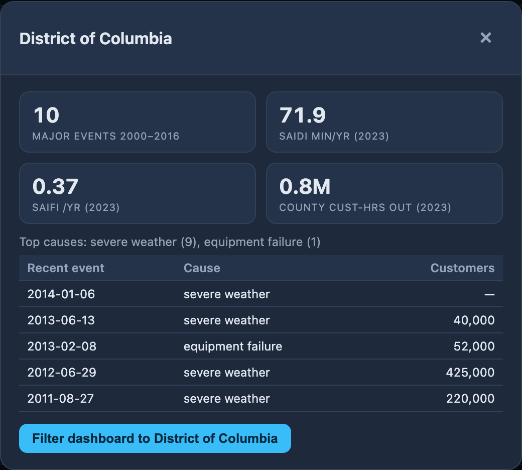
β–Έ click any state or county

8 Β· Click for detail

Click any state (or any county in county view) to open a detail card: major-event count, reliability (SAIDI/SAIFI), county outage-hours, top causes, and recent events β€” plus a button to filter the whole dashboard to that state.
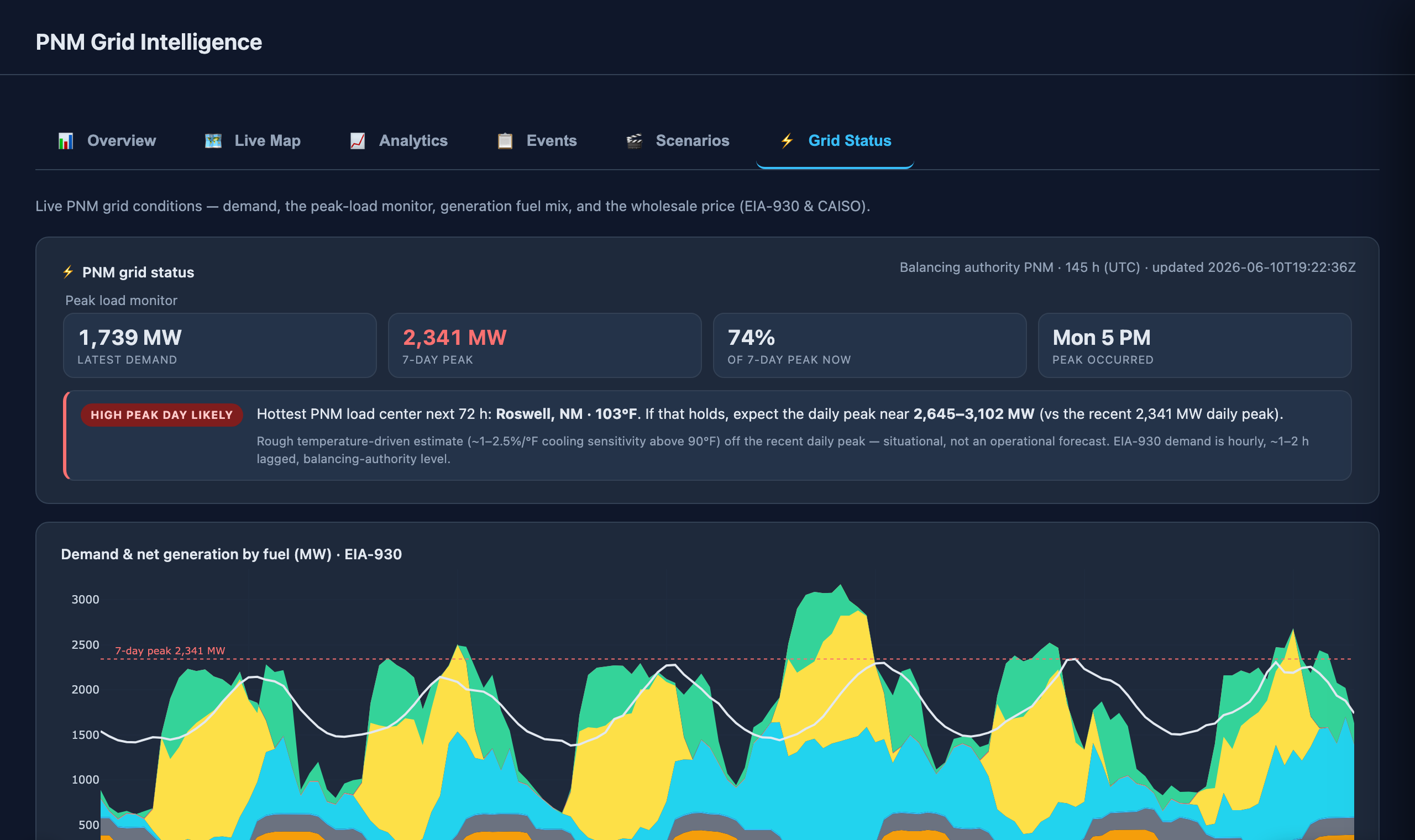
β–Έ live peak tracker (EIA-930)
β–Έ temperature-driven peak outlook

9 · ⚑ Grid Status tab

The Grid Status tab opens the peak-load monitor: latest demand, the 7-day peak (and when it hit), and how close demand is to that peak right now β€” all from EIA-930. Below it, a temperature-driven outlook reads the hottest NWS forecast high across PNM's load centers and flags the next peak day (Normal / Elevated / High) with a rough MW estimate. Then the live demand + generation fuel mix and the Palo Verde wholesale price (CAISO). The outlook is a clearly-labelled heuristic, not an operational forecast.

β–Έ red = dense vegetation on a line (encroachment hotspot)
β–Έ blue = transmission lines
β–Έ Rescan Β· dim the NDVI backdrop

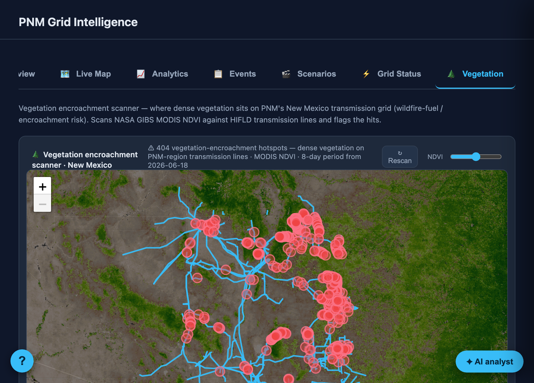
10 · 🌲 Vegetation scanner

The 🌲 Vegetation tab scans New Mexico's transmission grid against NASA GIBS MODIS NDVI and highlights the spots where dense vegetation sits on a line (red) β€” wildfire-fuel / encroachment risk. Hit Rescan to re-run; the NDVI backdrop is dimmable.

β–Έ one score from every layer
β–Έ deep red = highest risk

11 Β· β˜… Risk index β€” what it all unlocks

The payoff of every layer: this fuses drought, fire-weather, active fire, outage history & social vulnerability into one 0–100 county risk score (βš™ Layers β†’ "Wildfire-outage risk index"). Hover any county for its score β€” the "where should we worry today" view that powers PSPS-style decisions.